
Bright, Bold, Colorful Product Photography — Because Bland Doesn't Sell
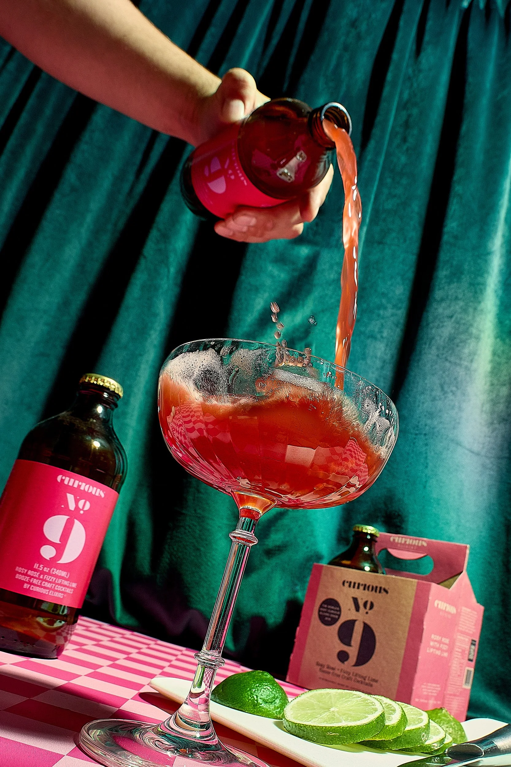
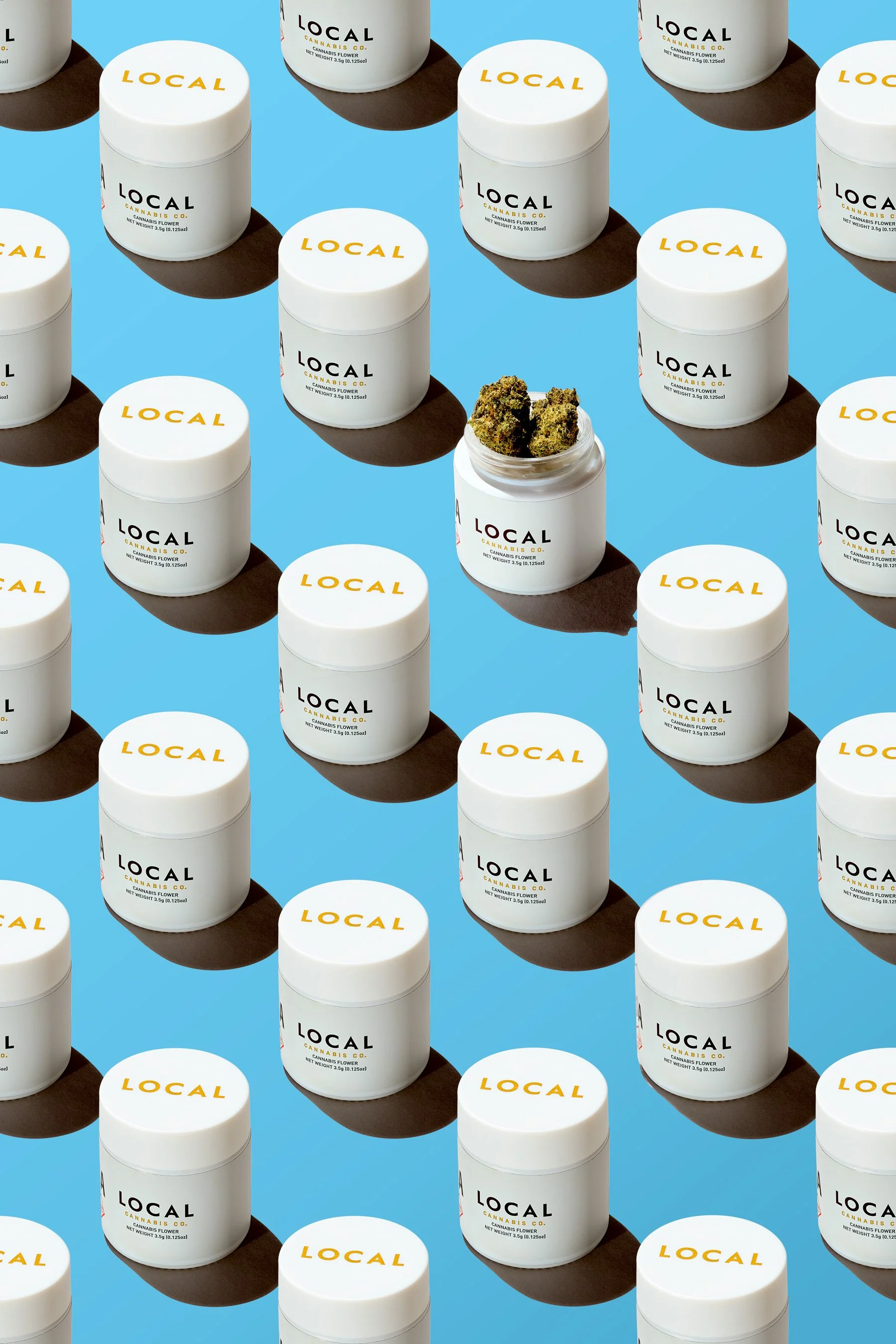
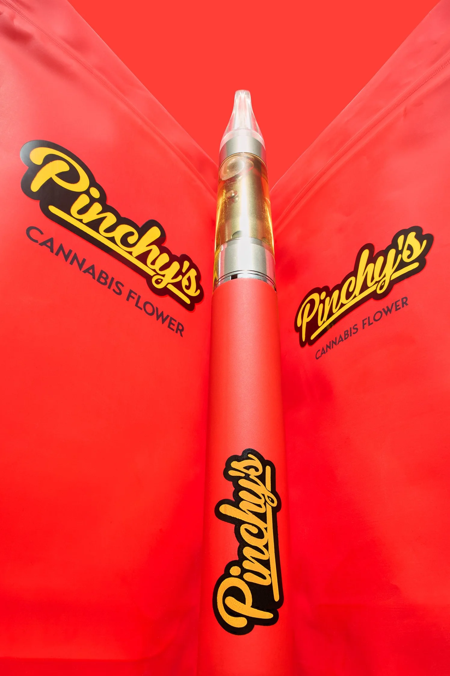
Color is one of the most powerful tools in commercial photography. The right palette stops a scroll, communicates a brand's personality, and creates an emotional response before the viewer has even read a single word. Bold, saturated, high-contrast product photography isn't just a stylistic preference for me — it's a deliberate creative strategy built around one goal: making your brand impossible to ignore.

Color as a Creative Decision
There's a version of product photography that treats color as an afterthought — a neutral backdrop, soft diffused light, let the product speak for itself. That approach has its place. But for brands with personality, energy, and a visual identity worth showing off, it's a missed opportunity.
The way I approach color is intentional from the first conversation. Background color, prop color, lighting temperature, and the relationship between the product's packaging and the environment it lives in — all of these decisions work together to create images with a specific visual energy. Sometimes that means a single bold color echoed across the entire frame. Sometimes it means a deliberate clash of saturated tones that creates visual tension. Sometimes it means letting a product's own color be the loudest thing in the image by stripping everything else back to a clean, complementary tone.
Every choice is made in service of the brand, not the photographer's ego.
What Bright, Colorful Photography Actually Requires
Shooting with bold, saturated color sounds simple. In practice it's one of the more technically demanding approaches in commercial product work.
Color accuracy under bright light. Saturated colors behave differently under studio lighting than they do in natural light or on a phone screen. Getting reds to stay red, greens to stay green, and yellows to stay yellow without blowing out or going muddy requires precise lighting control and careful calibration throughout the shoot and edit.
Composition that holds together. When every element in a frame is competing for attention with strong color, composition becomes even more critical. The eye needs a clear path through the image — a point of entry, a resting place, and a clear subject. Bold color without strong composition is just visual noise.
Color relationships that work. The colors in a product's packaging were chosen by a designer with specific relationships in mind. A good photographer understands those relationships and builds the set around them — choosing backgrounds, props, and surfaces that amplify the packaging's color story rather than fight against it.
Consistency across a content library. For brands creating ongoing content, color consistency across multiple images and shoot days is what makes a feed look intentional rather than scattered. I approach every project with an eye toward how the images will live together, not just how each individual shot looks in isolation.
Click here to view more of my most colorful images.
The Brands This Works Best For
Bold, colorful photography works particularly well for brands whose visual identity is built around personality and energy — consumer packaged goods with graphic, design-forward packaging; food and beverage brands targeting younger, social-first audiences; cannabis and wellness companies leaning into bright, approachable aesthetics; beauty and lifestyle labels where color is part of the brand promise.
If your packaging is already doing something interesting with color, my job is to build a world around it that makes that color feel even more intentional and powerful. If you're still figuring out your visual identity, bold color photography is one of the fastest ways to establish a distinctive look that stands out in a crowded category.
Color That Converts
Great product photography isn't just aesthetically pleasing — it performs. Bright, bold imagery consistently outperforms muted, low-contrast content in social media engagement, paid advertising click-through rates, and e-commerce conversion. Color communicates energy, confidence, and quality at a glance. In a content landscape where consumers make split-second decisions about what deserves their attention, leading with bold visual impact isn't just a creative choice — it's a smart business one.
Let's Build Something Vibrant
I'm based in Kansas City, Missouri and work with brands across the United States. If your brand has personality and you want imagery that actually shows it, I'd love to talk.
Ready to get started? Reach out at zach@zacherydavidphoto.com or send me a message on the contact page to book a discovery call.